Designing for DIY SOS in Carbis Bay

DIY SOS: The Big Build is BBC1’s BAFTA award winning home makeover programme. The programme is presented by Nick Knowles who, with his team of builders, a designer and hundreds of local volunteers, transform the homes of families across the country who have gone through difficult life-changing situations. I have worked on DIY SOS on and off for 7 years, including tonight’s episode in Carbis Bay, Cornwall.

 
Bright coastal style living room with blue and orange accents in the soft furnishings
 

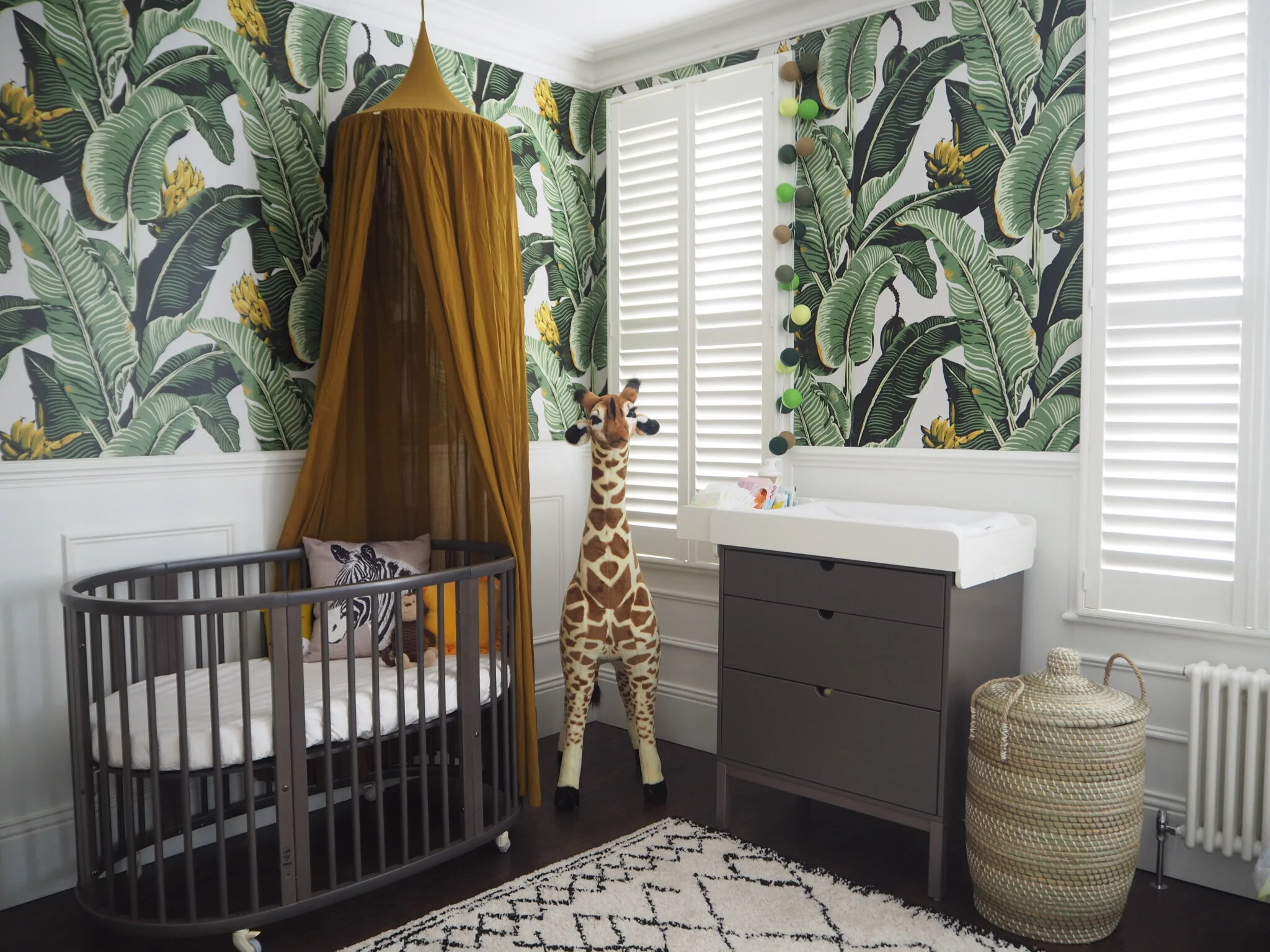
Stephen and Lynn Smedley spent 15 years fostering a total of 103 children and were ready for a well deserved retirement in their two bedroom bungalow by the sea. Unfortunately, tragedy struck in April 2017 when their daughter, Carrie, died suddenly leaving behind her 3 sons. With no dad on the scene, Stephen and Lynn brought their three grandsons home to live with them. When I visited the Smedleys’ home, the three boys were sleeping in a triple bunkbed in the same room, there was only one bathroom for the 5 of them and Lynn was doing all of her washing and ironing in the garden shed. It was obvious that they needed more space for everyone to be able to grieve and grow together. 

 
Bright white dining room with tongue and groove panelling on the upholstered banquette and walls.
 

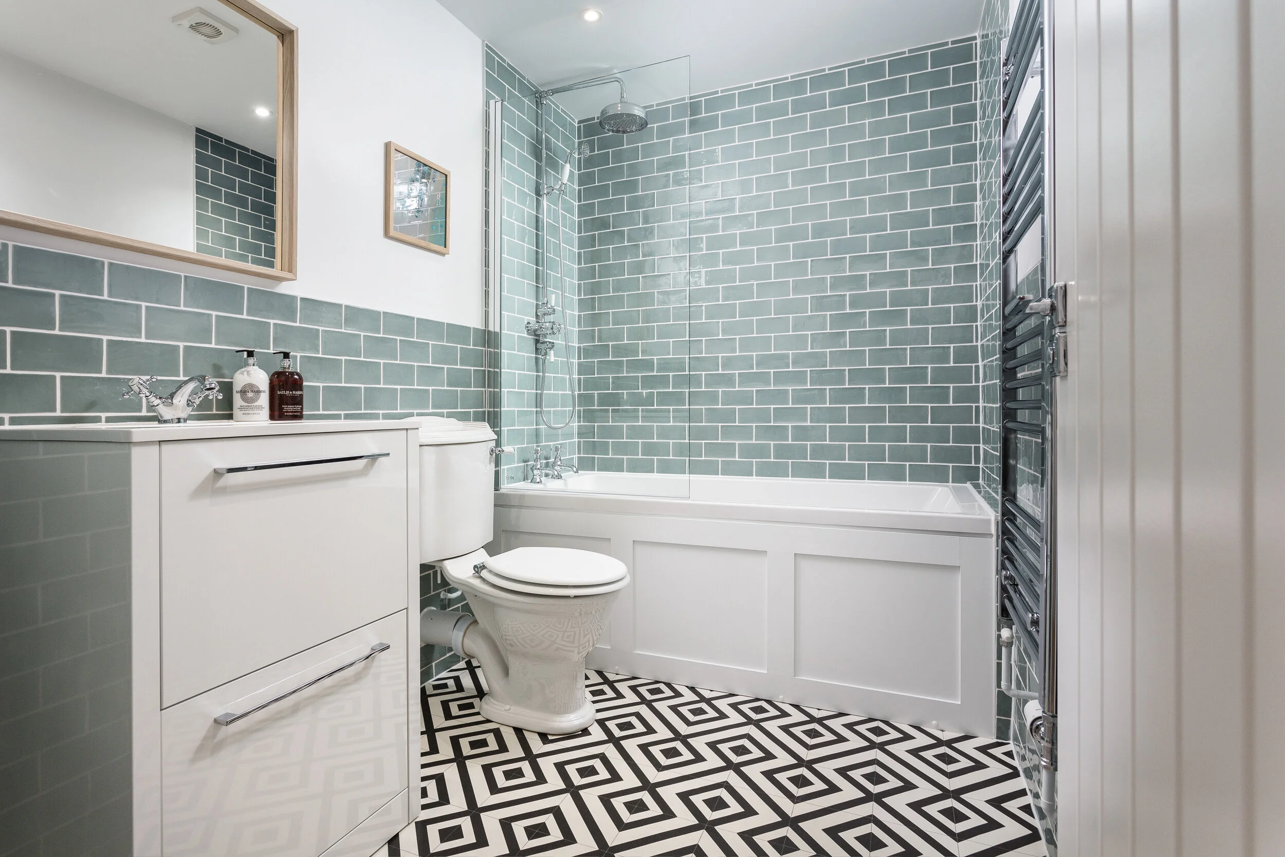
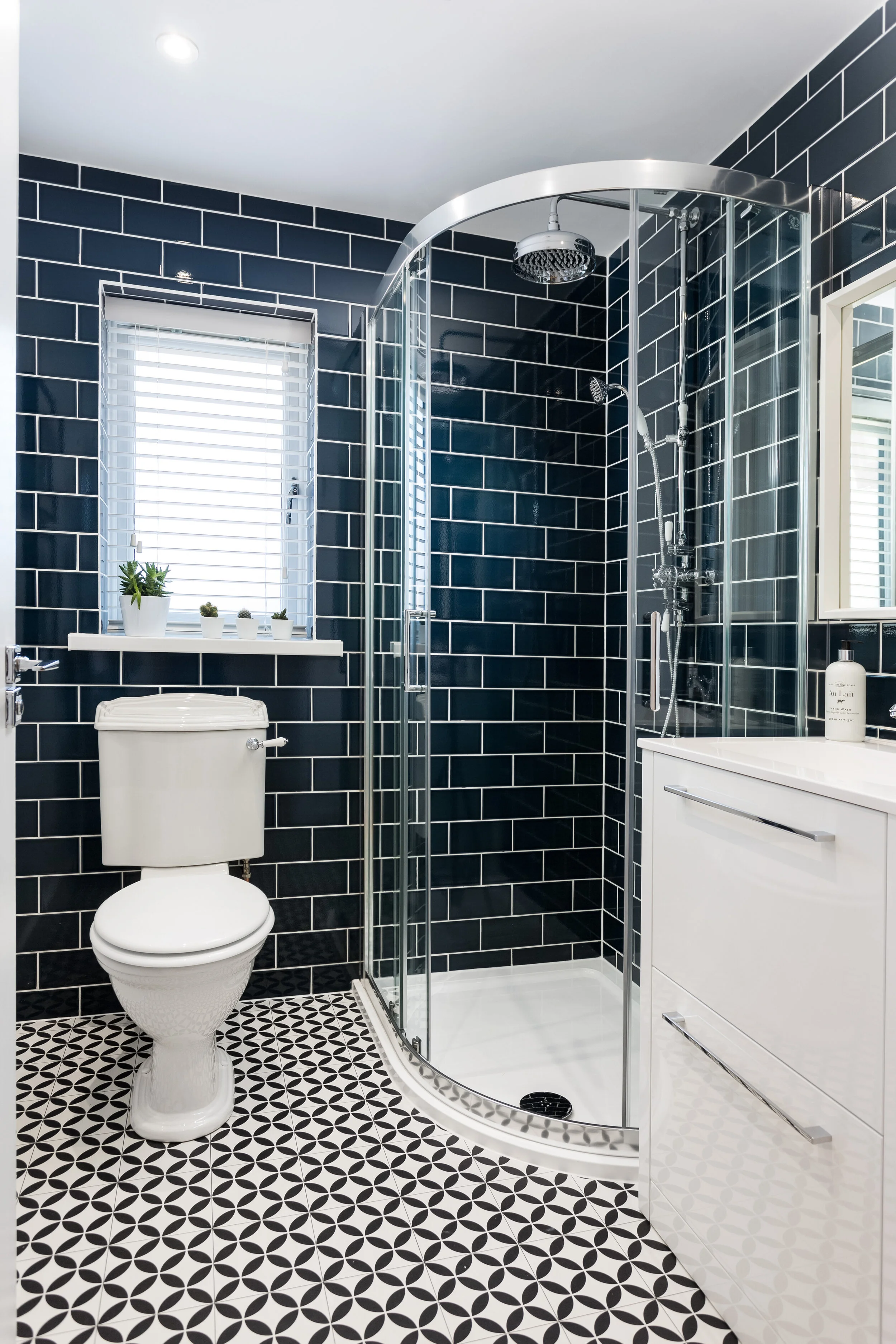
The most crucial part of the design was the new layout of the bungalow. We had to create two new bedrooms and a new bathroom. Also, we wanted to have two communal spaces in the form of a living room and a kitchen diner. Having this was important to the family as it would allow the boys to play their video games in one room whilst Stephen and Lynn could sit elsewhere. Many hours were spent drawing and redrawing the plans for the house - it really was a tight squeeze!

 
Turquoise bedroom with a white built in bed with orange soft furnishings
 

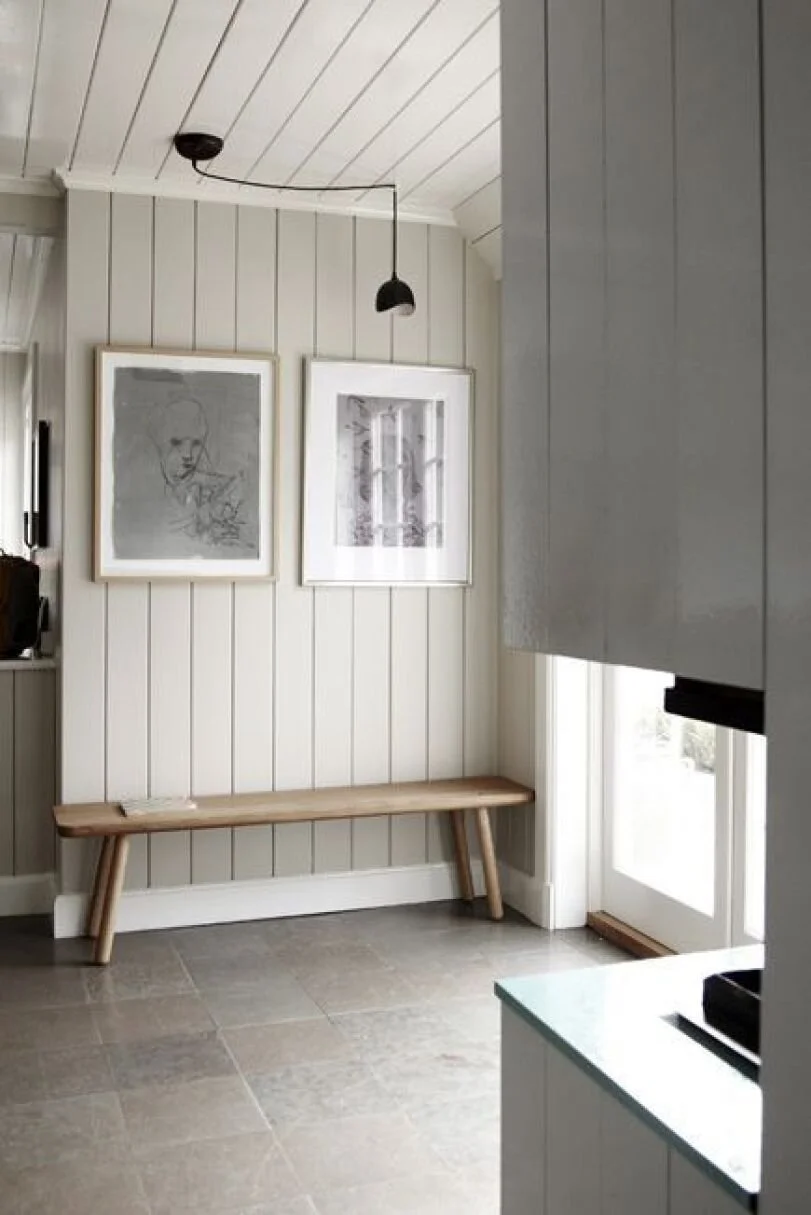
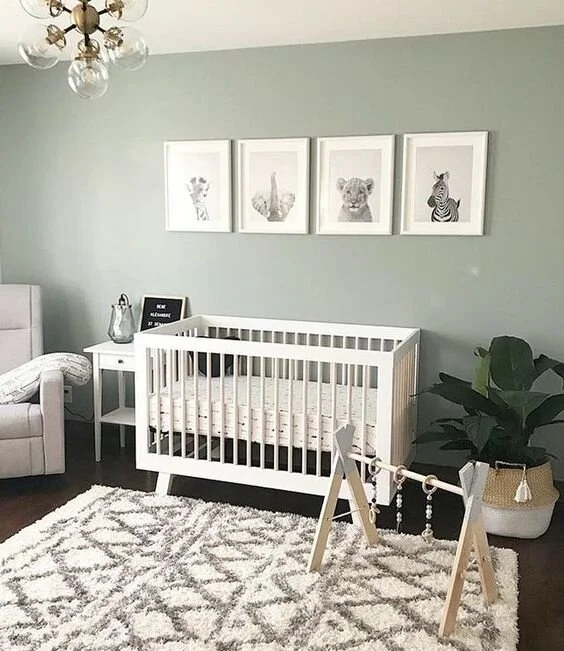
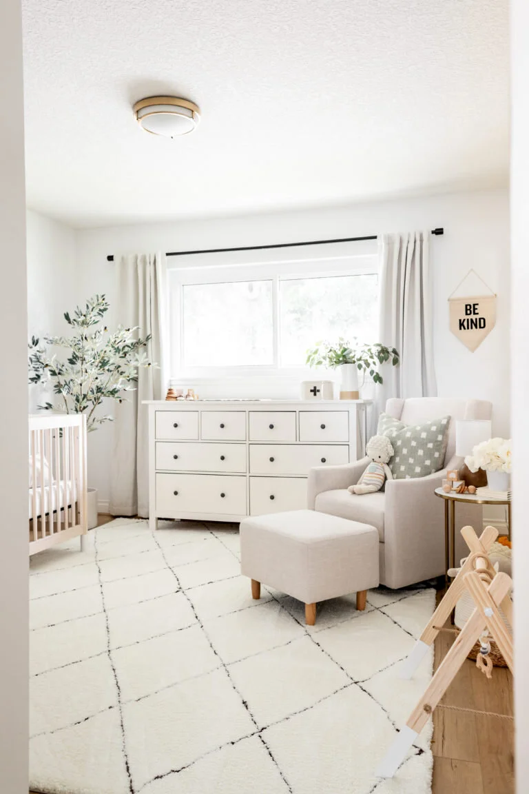
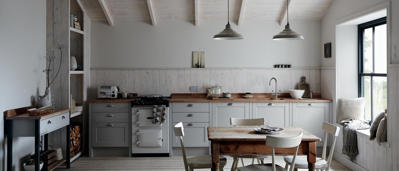
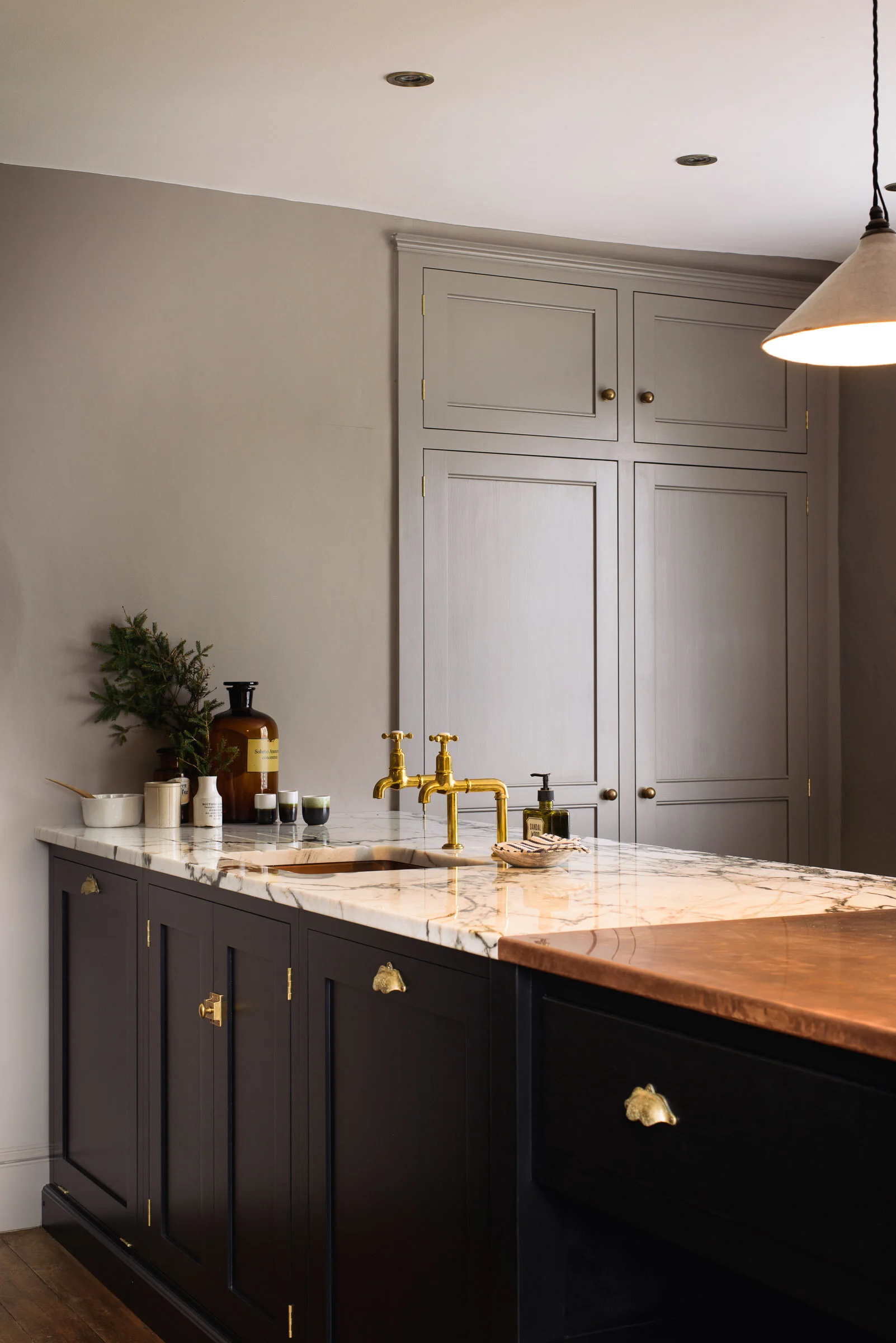
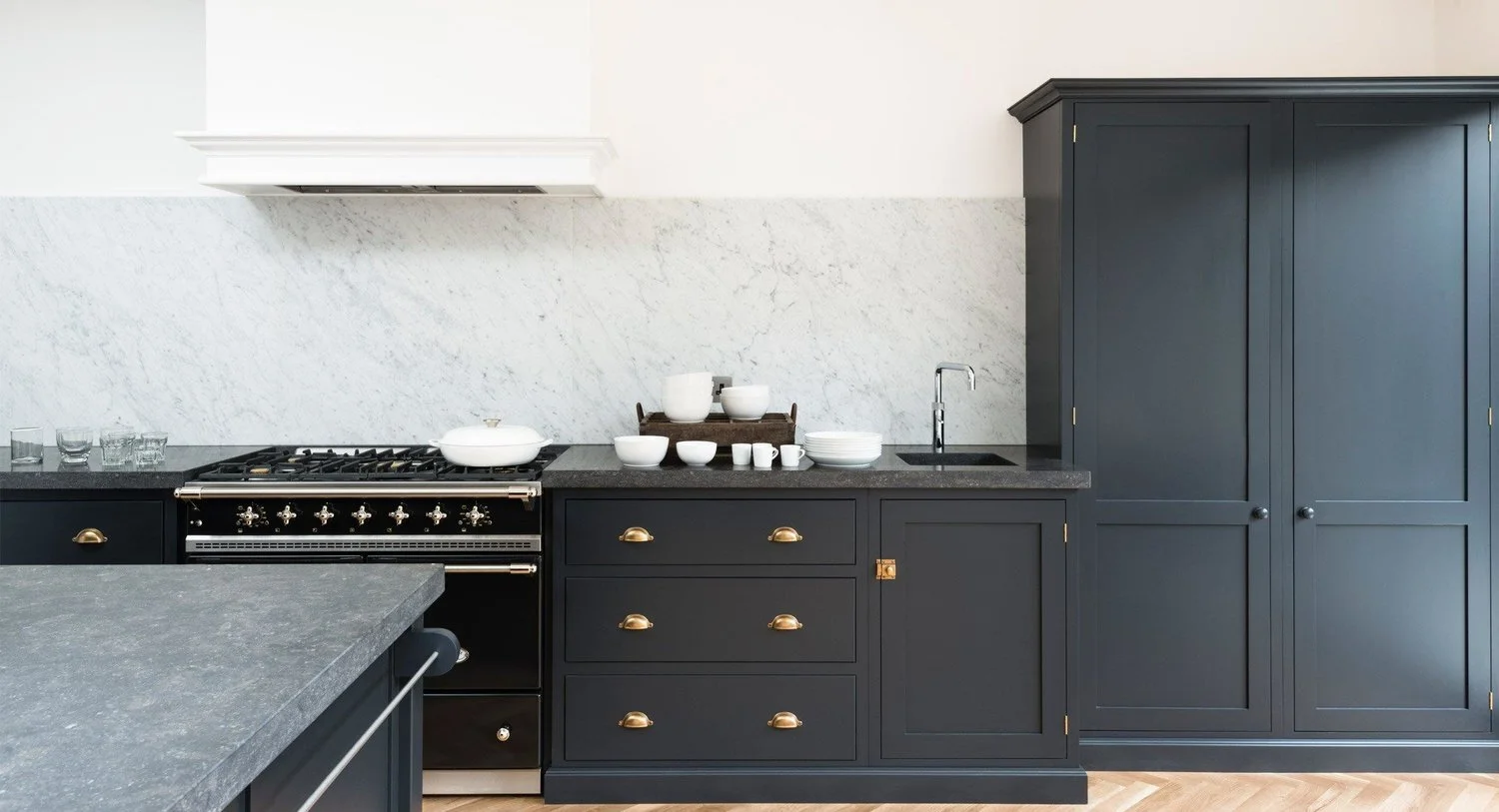
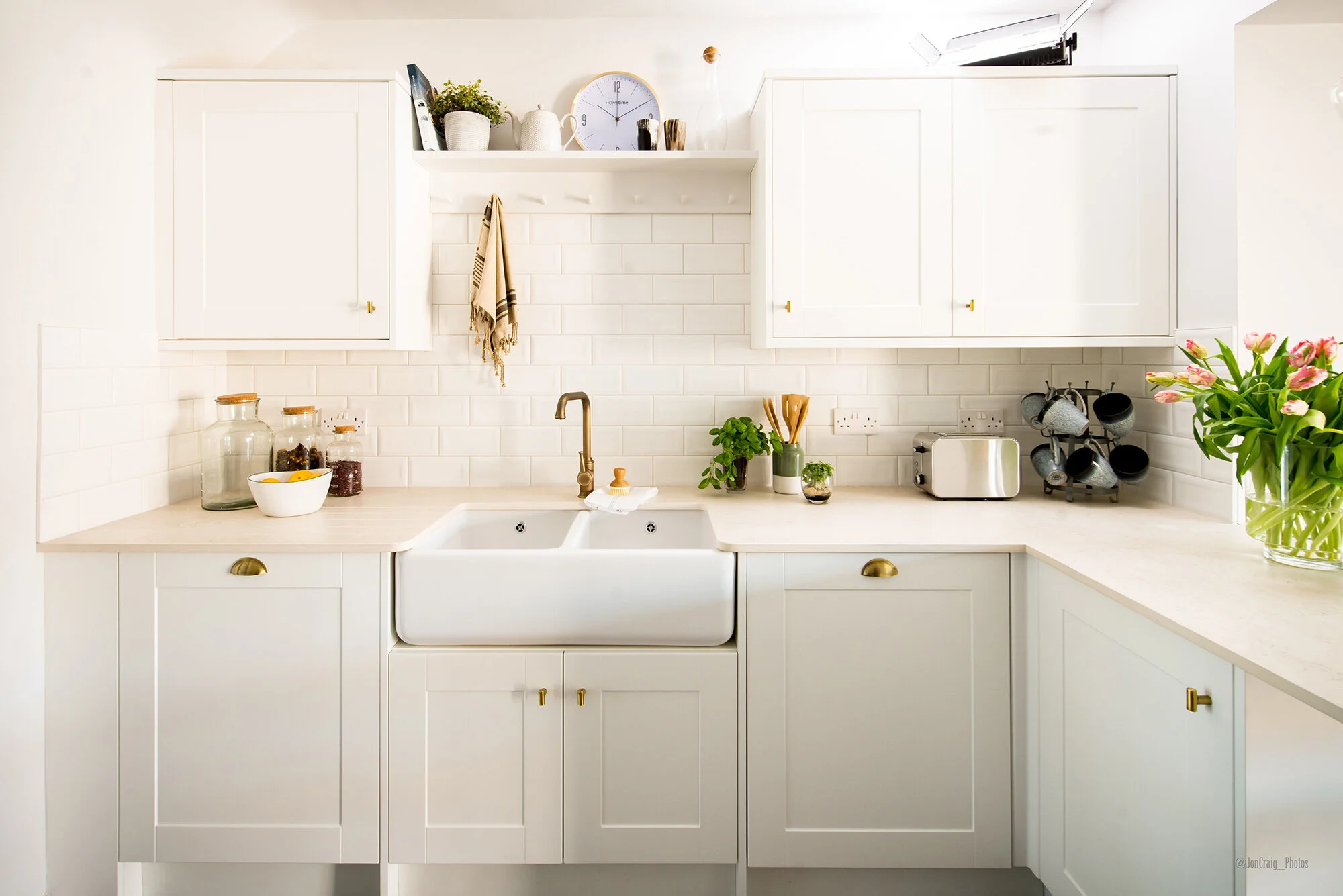
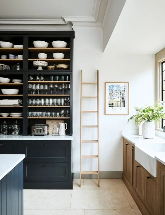
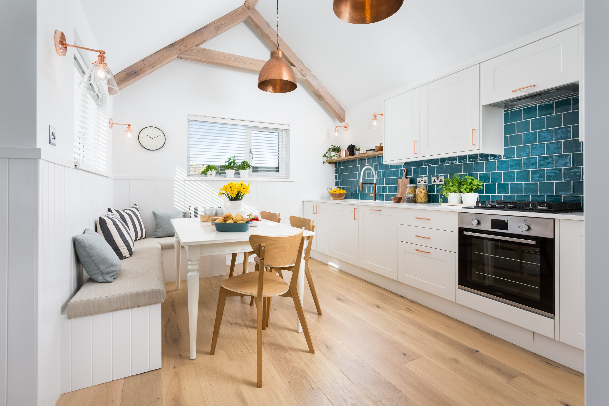
Working with Gabrielle Blackman is always a joy and this house was no different. We felt that the house needed to feel bright and spacious so we used an off white colour as the main colour throughout the house to reflect the light into the rooms, making them feel bigger. Also, with Carbis Bay being right on the Cornish coast, we wanted to use this image and incorporate the blue and green palette that you associate with the ocean into the scheme, so the majority of the rooms have those colours in them.

 
Off white master bedroom with tongue and groove feature wall and a blue upholstered bed
 

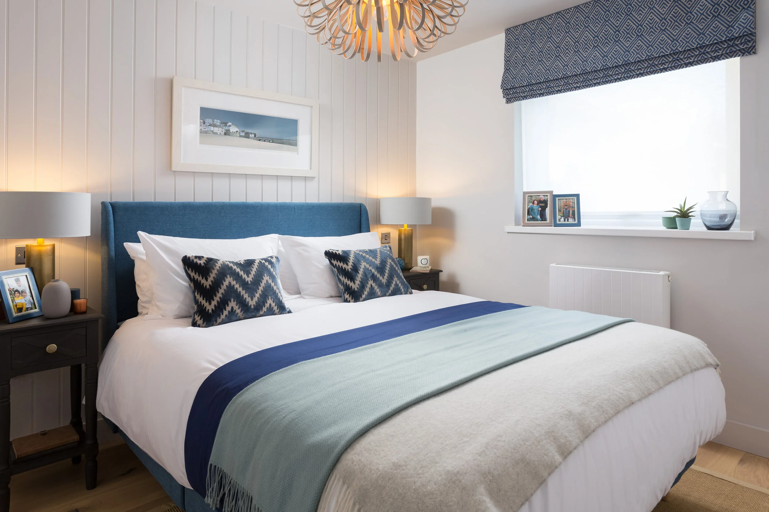
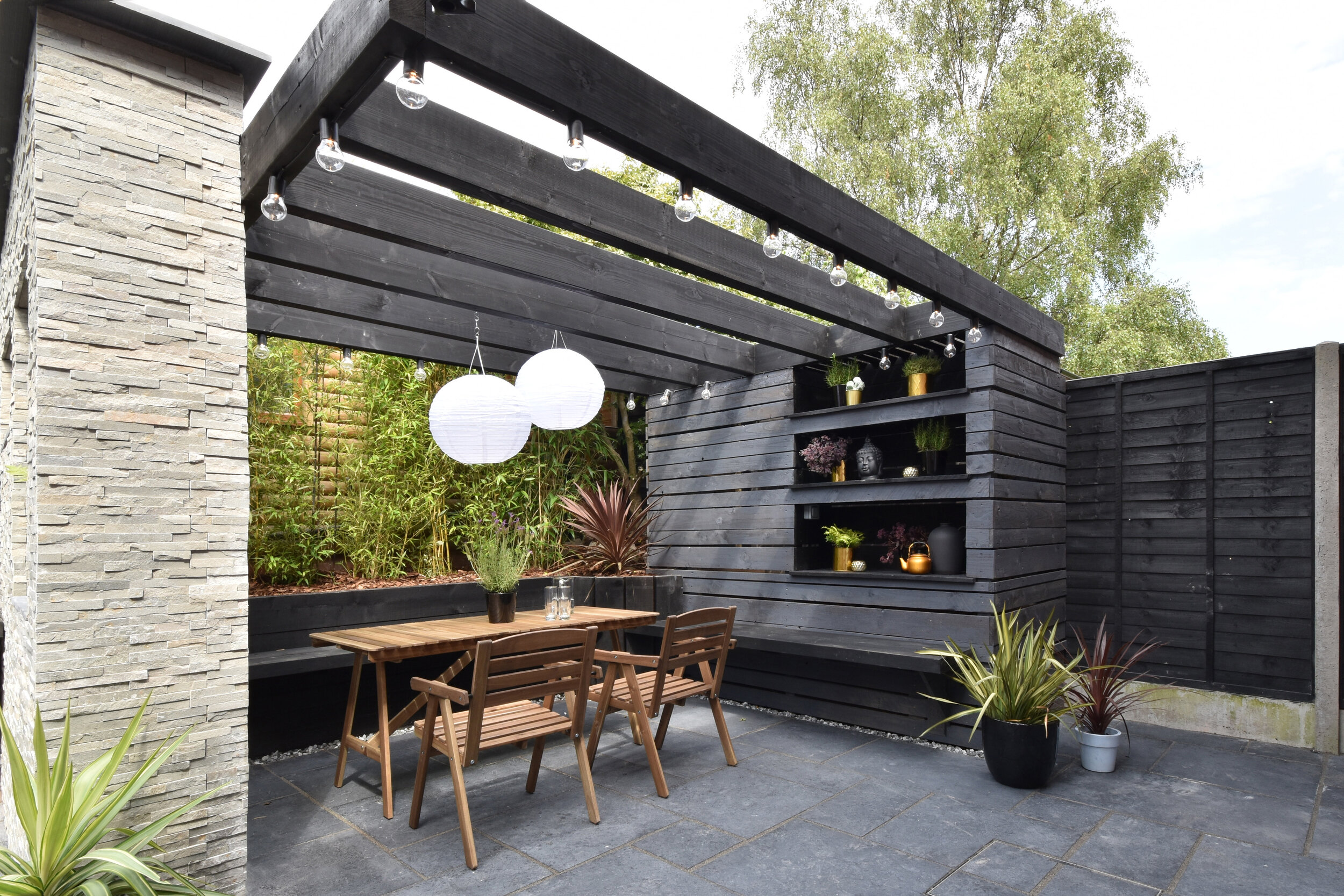
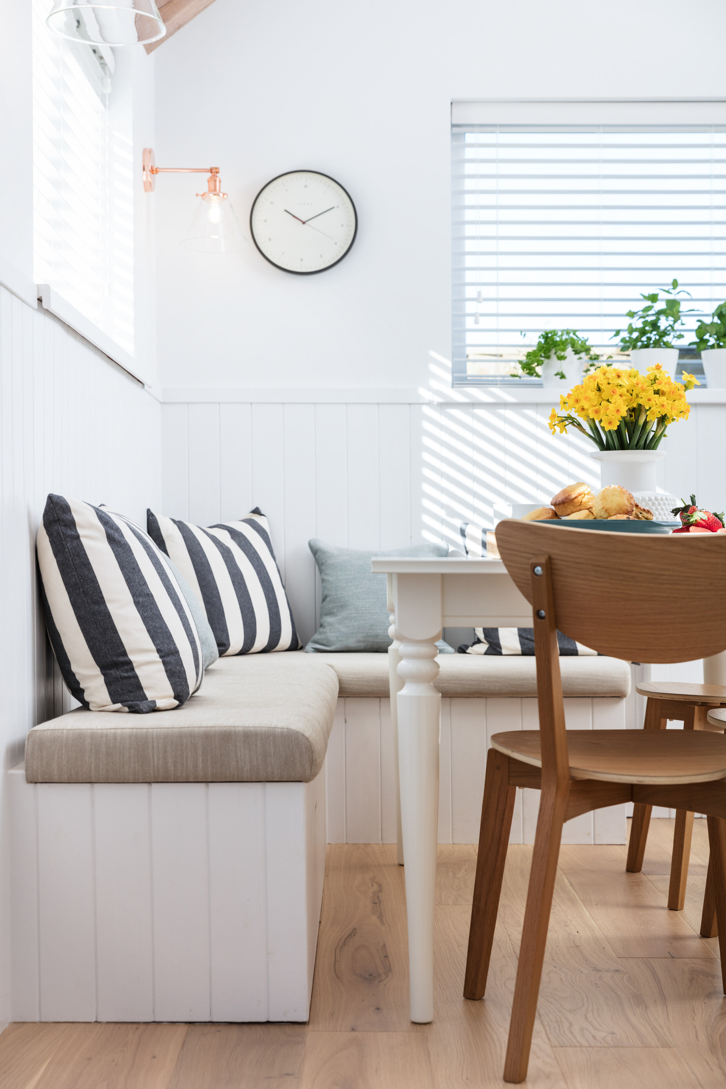
The living area needed to have enough space to fit all 5 members of the family, plus room for any friends they may have over if they were entertaining. We had New Concept Interiors make a bespoke armchair and sofa, so that we could get the seating to fit the room perfectly. We also incorporated a bench within the built-in TV unit to create that extra bit of seating. 

 
Bespoke built in TV unit with stripy upholstered bench under the TV
 

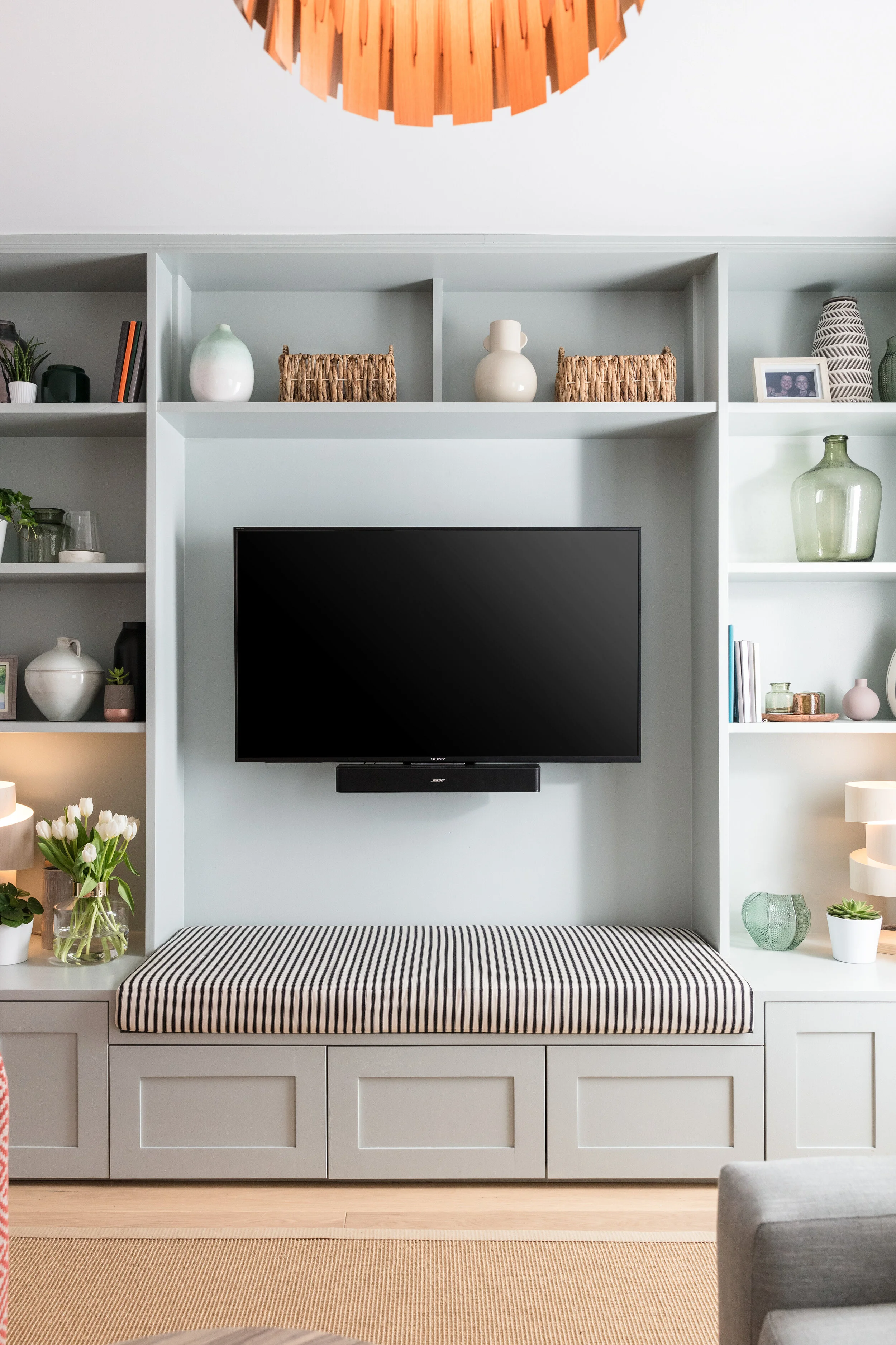
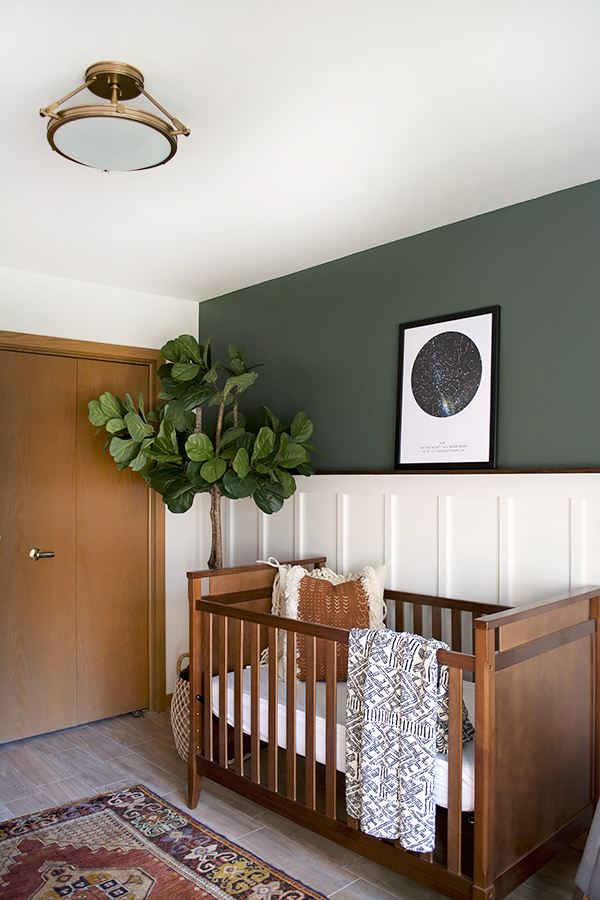
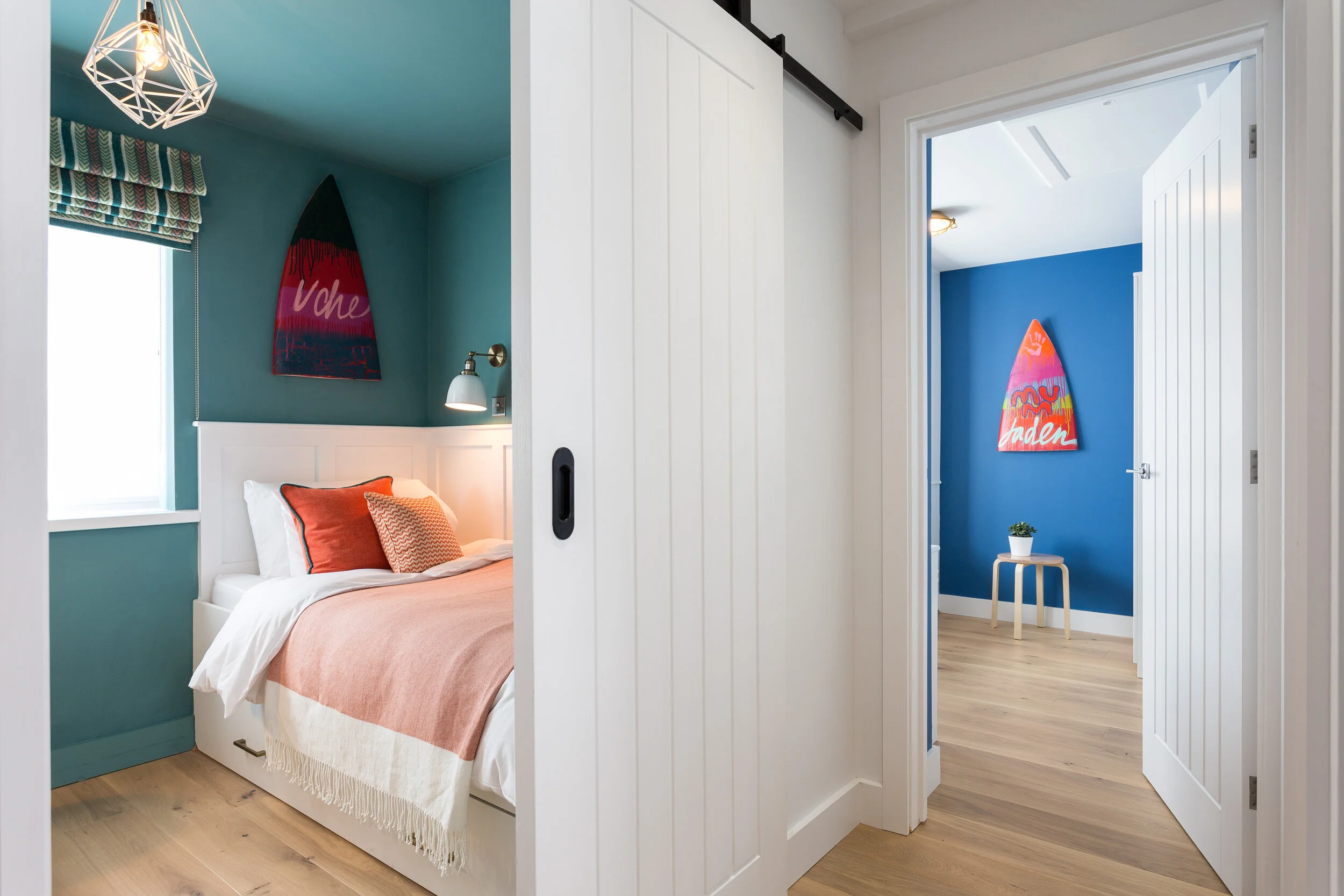
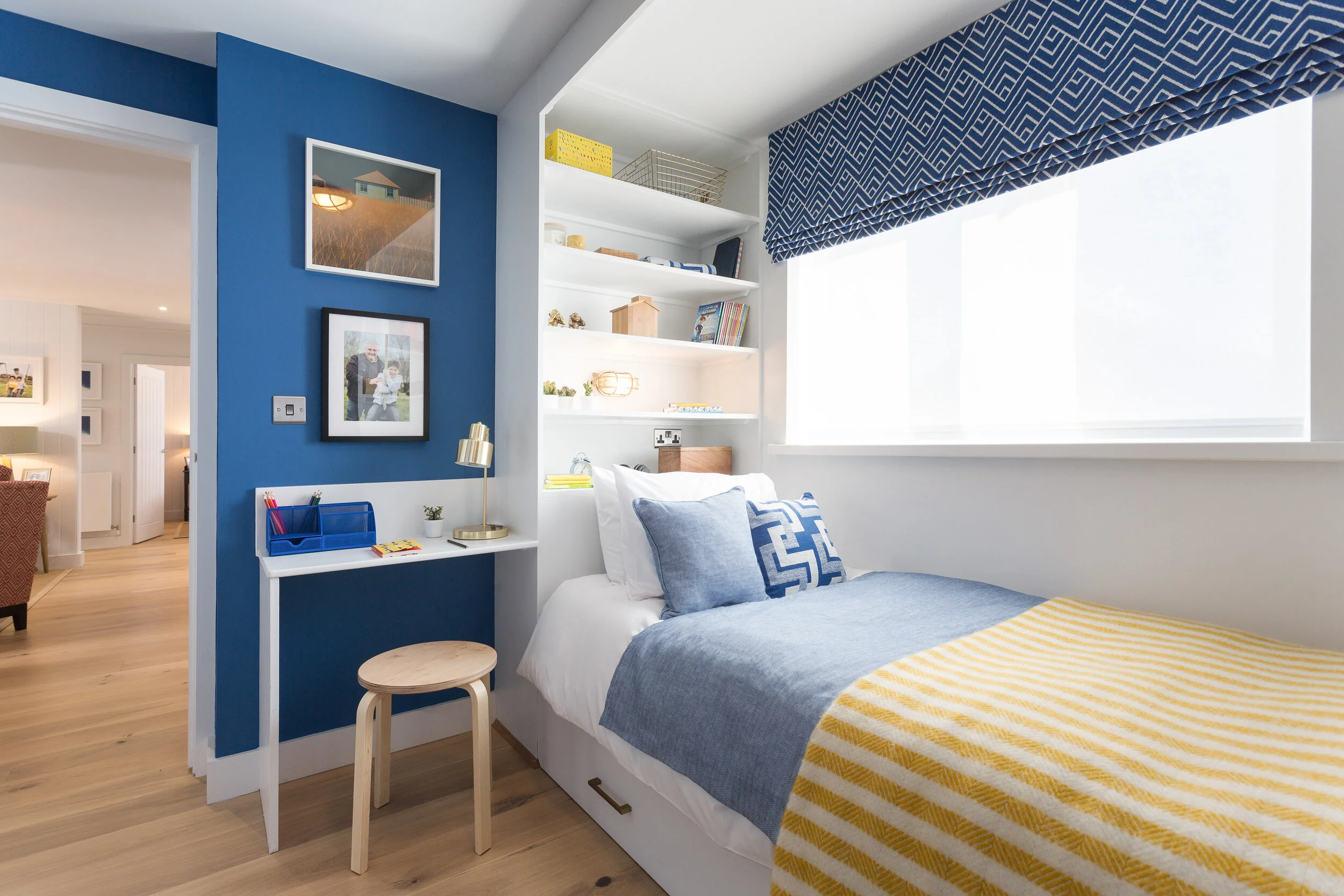
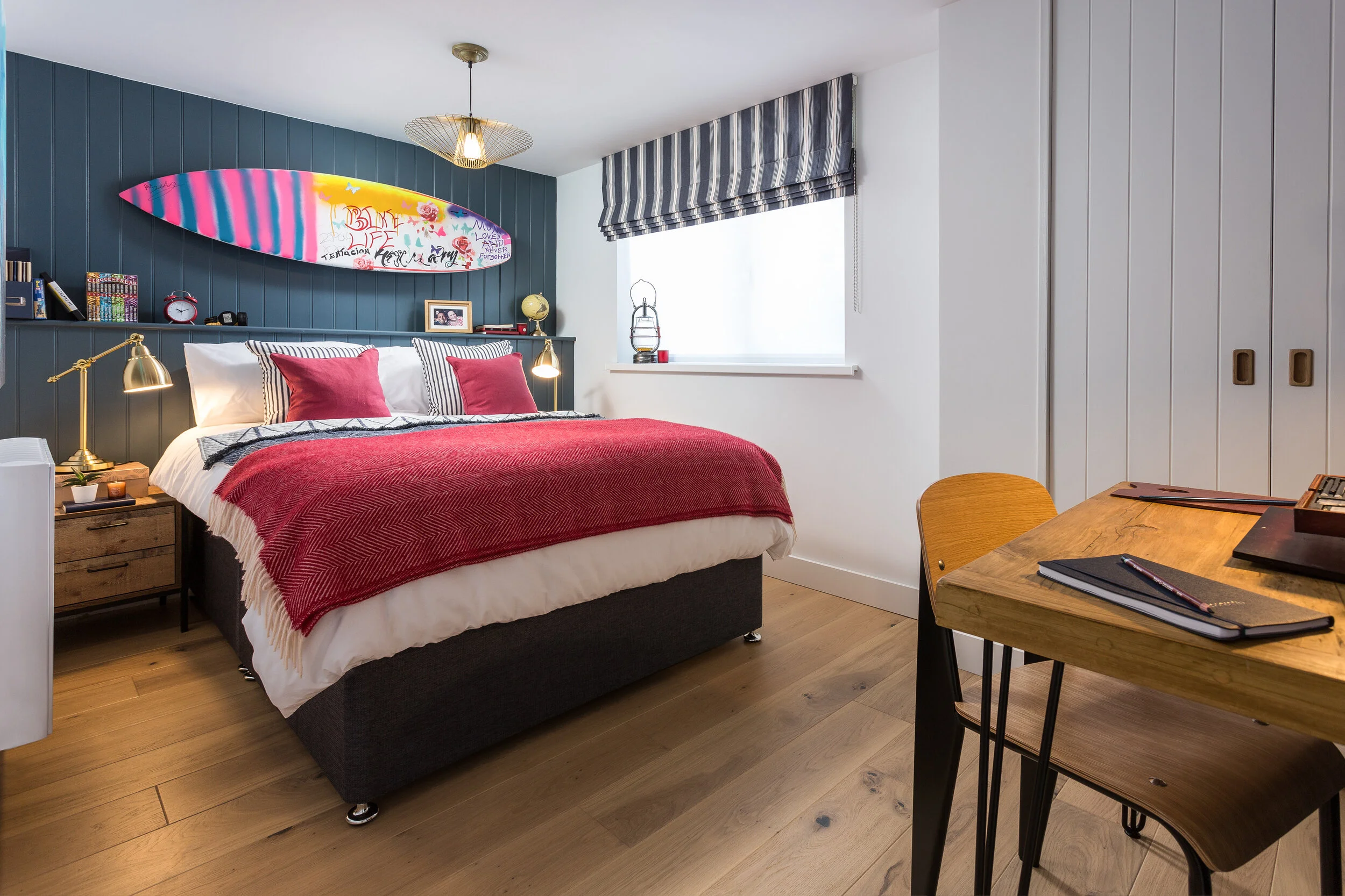
There was a lot of built-in furniture installed so that we could make the most of every nook and cranny that was available. The two younger boys also had built-in beds installed to maximise the floor space of their bedrooms. They were both also keen to be able to have their friends stay over so we designed their beds to have a pull-out bed under them too. Another design team tactic was to install sliding doors, creating more useable floor space.

 
Bedroom with a panelled door on a black sliding door mechanism
 
 
Blue bedroom with a white painted bespoke cabin bed containing shelving and a desk
 

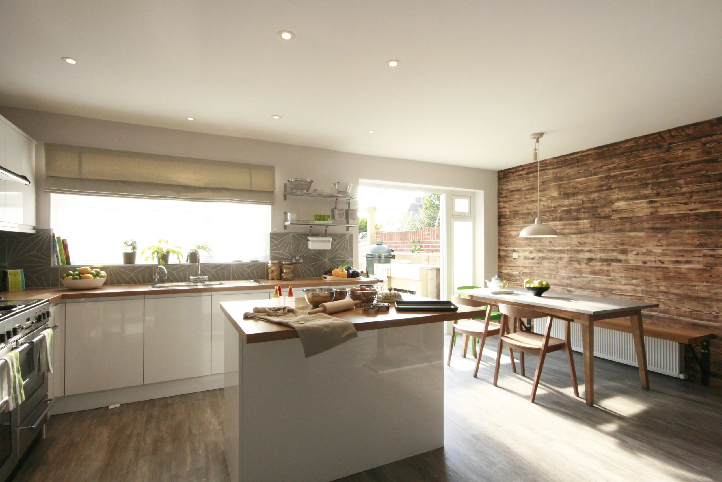
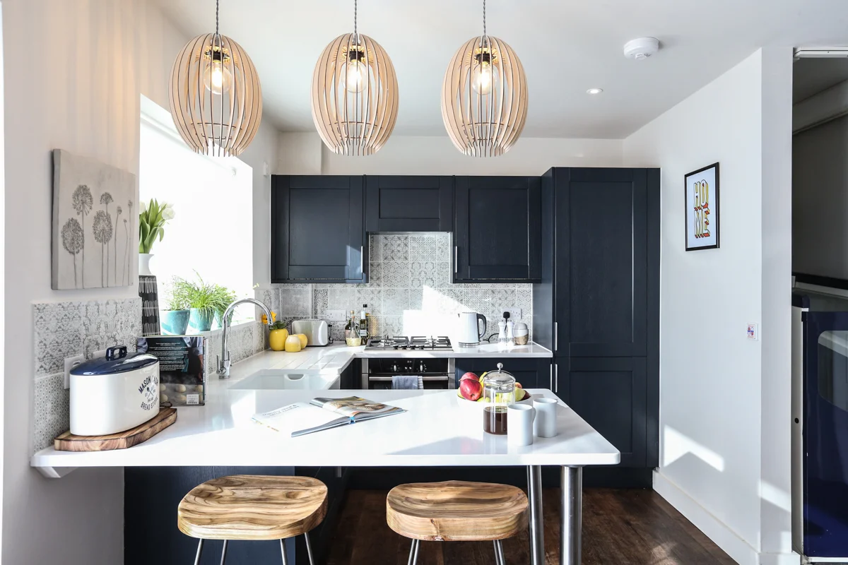
The kitchen diner was located in the new extension and was definitely my favourite room. As a design team we had begged the build team to allow us to do an internal pitched ceiling and we had finally been granted permission. It was worth the wait! Again, with our maximising of space at the forefront of the design, we incorporated a banquette to allow more people to sit around the table. Although the room was painted white, it still felt cosy because of the warm timber floor and the beautiful copper accents in the lighting and kitchen handles. 

 
White kitchen diner with square turquoise tiles an exposed oak beam ceiling
 

Working on DIY SOS is such a treat and this project was definitely one of my favourites. We had a wonderful, talented production team and amazing trades and suppliers working on the Smedley’s home. To catch up click here. For a list of the products used on DIY SOS: Carbis Bay click here

 
Double bedroom with a charcoal painted tongue and groove feature wall with a surfboard above the bed
 
 
Green bathroom with a shaker style panel, metro tiles and a black and white geometric floor
 
 
Shower room with dark navy metro tiles and black and white patterned floor
 

All photography by Elliott White Photography

Timeless Interiors: Timber Panelling

Timber panelling has gone in and out of style many times throughout the centuries and today it is back. Not only is it popular in the home, it is also popular in commercial settings, such as restaurants, offices and schools. Panelling has an amazing ability to add character and texture to a space and it can also visually change the proportion of a room.

 
Image From: Rock My Style

Image From: Rock My Style


Panelling wasn’t always used to create an atmosphere or an aesthetic of a space. For example, initially, timber panels were installed to provide insulation to cold stone walls. The Tudors lined their walls with timber from the floor to the ceiling to show their wealth. They made their wooden panelled walls decorative and so the aesthetic became more important.

 
Image From: Shevy Vision

Image From: Shevy Vision


There are many different ways that you could include panelling in your home and here are a few ideas for inspiration:

1. Traditional

If your home is an older property, for example Elizabethan, and you wanted to add some character to it, you could reinstate some of the old panels that may have been in the original design of the house. It is worth researching what was around during the time period to make sure you aren’t installing something that was designed 200 years later. For an Elizabethan property, from the 16th century, the decorative Tudor style was replaced with a rectangular style with mitre moulding. This plainer style panelling would have been made of exposed oak which you could install if you wanted to replicate the traditional style. However, if you wanted a more modern look you could install painted rectangular panelling like the one shown below.

 
Image From: Rock My Style

Image From: Rock My Style


2. Create Pattern

Tongue and groove boards are really good for creating patterns. Traditionally they are used horizontally or vertically but if you want something a bit different you could install them diagonally or in a basket weave arrangement.

 
Image From: Pinterest

Image From: Pinterest


MDF boards are a great material to use to create panelling as you can cut it to any size you require and arrange it as you would like. You could put the panels only millimetres apart to create beautiful shadow gaps.

 
Image From: Pinterest

Image From: Pinterest


3. Protect Walls

In the Georgian period it was popular to place all your dining chairs against the walls instead of around the dining table. It, therefore, became popular to panel from floor level to dado height (which was originally 600mm from the floor) so that the Georgians could protect their walls from any wear and tear from the chairs. Today it is common to see half panelled walls in areas that might have a lot of traffic, for example the hallway in a home is often panelled and in a commercial space you might also see half height panelling such as in parts of a shopping centre or a hospital.

 
Image From: Real Homes

Image From: Real Homes


4. Proportions 

You can play with the proportions of a room with panelling and trick the eye to make it feel bigger than it actually is. If you want a room to feel wider, install vertical panelling from the floor to the ceiling. If you have a high ceiling and want to make the room feel a bit more enclosed and cosy, panel up to picture rail height (approximately 300-500mm below the ceiling) and paint the area above the same colour as the ceiling. This will help to make the ceiling feel that 300-500mm lower than it actually is.

 
Image From: A Beautiful Mess

Image From: A Beautiful Mess


5. Exposed Timber

It has been proven that having plants, flowers and timber inside a commercial or residential space make a room feel calmer. It is also better for our mental health. Reclaimed timber can be used to create exposed panelling which gives a room more character because of the different shades of recycled wood. Examples of reclaimed timber are old floorboards, scaffolding boards and timber pallets. These, as well as being cheaper, are better for your carbon footprint.

 
Image From: Stephanie Williams Designs

Image From: Stephanie Williams Designs


There are so many benefits to panelling - why wouldn’t you want to include it in your home? It’s even perfect for that small box room or in your hallway to protect the walls. Panelling will make any home look unique and add character and style.

Alternative Ideas for Your Baby’s Bedroom That Aren’t Blue or Pink

It is the dream of many people to be able to design and redecorate a room in their house from scratch, with new furniture, new colours on the wall and new soft furnishings - the whole lot. A great time to do this is just before you have your first baby. When I was expecting my baby, many midwives, parents, friends and even random people on the street asked me if I had been ‘nesting’. Initially, I thought this just sounded a bit strange and I didn’t really understand what they meant but I soon realised that it really is a mum’s opportunity to release her inner interior designer and create a beautiful bedroom for the new arrival.

 
Image From: Bre Purposed

Image From: Bre Purposed


At some point in the last century we have become less creative when it comes to the interior design of a baby’s bedroom and we have stuck to society’s norm: blue is for boys and pink is for girls. This, however, wasn’t always the case. Back in Victorian times, they would dress boys in a paler version of the colours men would wear, such as red, hence why boys often wore pink. During the 20th century, however, there was a turn and today pink is synonymous with girls.

So let’s be creative and break today’s stereotype! Let me give you a few ideas to make sure your baby’s bedroom isn’t a cliché and is, instead, unique, stylish and beautiful.

 
Image From: Project Nursery

Image From: Project Nursery


1. Alternative Colours

If you want to paint your baby’s bedroom in a brighter colour, green is a great gender-neutral colour to use. Its association with nature and the outdoors will make your baby’s room feel restful and calm. Other gender neutral colours you could use are red, orange or yellow, however, these colours are quite vibrant and not particularly relaxing, so would be better as an accent colour, in things like the curtains or blankets, but not to use to paint the walls.

 
Image From: Pinterest

Image From: Pinterest


Neutral colours such as white, grey or a light shade of beige are great shades to use for a fresh bedroom feel. I would advise not to go for a ‘bright white’ colour as it will make the bedroom feel like it hasn’t been thoughtfully designed and it will make the room feel quite cold and bare. By choosing a shade of white, such as Farrow and Ball’s Strong White, the room will feel much cosier. For a shade of beige, Farrow and Ball’s Lime White is a really interesting light shade which makes a room feel much warmer and homely.

 
Image From: Halfway Wholeistic

Image From: Halfway Wholeistic


If you were to go for neutral coloured walls, but still wanted to add a bit of colour to your baby’s room you could do this through the furniture and accessories. You can paint your changing table or chest of drawers or use brightly coloured bedding in your cot. The nursery in the image below has a rainbow-coloured theme to it, meaning that anything bright and colourful fits into the colour scheme and looks great when displayed.

 
Image From: Studio DIY

Image From: Studio DIY


2. Wallpaper

At around 3 months a baby can see patterns, so why not encourage this development with a bit of wallpaper in the room? Instead of choosing a colour as the main theme to a room you could have an amazing wallpaper instead. There are some incredible animal wallpapers or nature wallpapers or even geometric patterns. The wallpaper doesn’t just have to go onto the walls, babies spend a lot of time on their back looking at the ceiling so why not wallpaper the ceiling?

 
Image From: House Lust

Image From: House Lust


3. Decals

Another easy and cheaper way to make the walls of your nursery more interesting, instead of wallpapering them, is to use wall decals. Wall decals are stickers that you can stick to the wall, but they have been made so that they can be easily removed without damaging the paint (so great if you are renting your home). There is a massive variety of decals that are available designed with large groups of leaves and trees to individual stars and circles which you could arrange into patterns for your baby to enjoy.

 
Image From: Just Kidding Store

Image From: Just Kidding Store


I hope these ideas have provided you with some alternative ideas to think about when designing a nursery, if you decide not to decorate using blue or pink. Enjoy, as this is your opportunity to create a beautiful bedroom for your baby.

How To Revamp Your Patio Area Whilst In Lockdown

With the whole nation being told to stay at home, people are taking advantage of their gardens more than ever. From a glance at social media, it is clear that many have taken up gardening and are finally getting around to those odd jobs in the back yard that they had been avoiding.

One often forgotten area of the garden is the patio. For us Brits, it only gets used for a few months of the year, this forgotten space that is part of the garden yet also an extension of your house. It’s an area that is often devoid of any design as it isn’t part of the landscape designer’s remit nor an interior designer’s scheme. Hence it often ends up as a decked space with some garden furniture, with little consideration into its design.

 
Image From: Livvy Land

Image From: Livvy Land


As everyone is using their patio space more than usual, I thought it would be great to look at how you could revamp it. We want our patio areas to be comfortable, cosy and inviting - the same as we want our homes to be. So here are a few ideas:

Colour and Style:

Start of by choosing a style and a colour that you like. If you are worried that your patio space will look out of place in your property then get inspired by what’s already there. You could use a colour taken from the flowers or trees in your garden or be inspired by the style and colour in your house. If your dining space opens up into your patio, include that colour in your patio space so you can create a seamless design inside your home and out. 

 
Image From: House Beautiful

Image From: House Beautiful


Soft Furnishings:

Soft furnishings are the prefect way to bring some colour and style into your patio area. There are loads of outdoor cushions available to make your seating as comfortable and colourful as you require. It’s best to have one main colour and then a couple of accent colours, for example, adding black & white patterns and mustard can add some interest and vibrancy to the grey cushions that came with your garden furniture set. 

 
Image From: Argos

Image From: Argos


There are also some amazing outdoor rugs that you can buy to bring some colour into your patio which would also serve to create a more domestic look by bringing the inside out to your garden. These outdoor rugs are made from woven plastic, so they won’t get ruined if it rains and they are also super lightweight making them easy to pack away. 

Another key piece of soft furnishing for the garden is the blanket - perfect for wrapping up in whilst you cuddle up with your family in the evenings with your hot chocolate around the fire pit or even in the morning with your cup of coffee and newspaper (although, realistically, this is probably an app on your phone).


Lighting:

Lighting can bring a calming ambiance to your garden in the evenings. Festoon lighting is a really exciting way to light up your patio space by either creating a canopy above the dining space or hanging it around your garden fencing. This means you can evenly disperse the light and make the patio space much brighter in the evenings.

Another way to light your patio space is with candles in jars (so that they don’t blow out). There different styles of jar you can use for the candles, a hurricane lantern being quite a classic design or you could even reuse a jam jar if you are going to go for that quintessentially English look.

 
Image From: Crazy Chic Design

Image From: Crazy Chic Design


Shelter:

By creating some sort of canopy above your patio it will feel more enclosed and therefore cosier. As previously mentioned, the idea of festoon lighting is one possibility but you could also create a covering with a parasol, a sail shade (like the one in the photo below) or, if you like a bit of DIY, you could build yourself a pergola. There are many different colours and styles of parasol and shade sails so you can again bring some colour to your patio space.

 
Image From: Pinterest

Image From: Pinterest


Potted Plants:

If a patio space was to have no furniture in it then it would literally just be a blank space with some flat paving. By adding some potted plants you can bring some of the greenery from your garden to the patio space. It’s also worth considering the shape and colour of the pots that you use so they can tie in with your patio furnishings. If you decide to incorporate the colours from your house, this will help your patio create a perfect blend of your garden and your home. Try arranging your pots and planters in groups of threes or fives for a more sophisticated look that will give shape to the space and avoid too much linear progression. 

 
Image From: Stephanie Williams Designs Photography By: Impact Photography

Image From: Stephanie Williams Designs

Photography By: Impact Photography


By thinking about the colours and style you like and adding a few domestic items into your patio space you can make an entirely new cosy place to sit out in both in the daytime and in the evenings. Enjoy! 

Timeless Interiors: The Shaker Kitchen

Designing something to be timeless is impressive and incredibly difficult. Think of a Chesterfield sofa or a Volkswagen Beetle or even a Rolex watch - these items are all considered classics. They were fashionable in their day and still fashionable now. It is difficult for them to be out of place. Were they designed to be timeless? Probably not, but they have managed to all age well over time. 

There’s an argument to be made that in the world of interior design, the equivalent to these timeless classics is the Shaker Kitchen. It is a design favourite and it seems incredible that we are still installing this 18th century style of kitchen 300 years later. The original designer of the shaker kitchen definitely wasn’t designing it to be timeless, in fact it was designed to be purely functional.

 
Image from: Howdens

Image from: Howdens


I love history, so let me nerd out on you for a paragraph or two. The original designers of the Shaker Kitchens were part of a denomination of the Quaker religion, known as the Shakers due to their shaking and dancing during their meetings. As part of their religious beliefs they lived a self sufficient lifestyle in closed communities, dotted throughout America. The Shakers produced all of their own furniture using local materials and even made the equipment to help them, for example they invented the circular saw, the flat broom, tongue and groove boards and even the apple corer.  

Their furniture and kitchens were designed to be simple, durable and functional, reflecting their way of life. The beauty of their furniture was in its honesty with the exposed timber that it was made from and the exposed joints. The furniture was eventually mass produced and was sold around the world becoming a firm favourite in many households. 

How could this simple and insular closed community create such an impact on our kitchens today? The Shakers were only designing kitchens and other pieces of furniture for their community to use, so they could never have envisioned that we would still be installing their kitchens into the next millennium. What is it that makes them so timeless?

 
Image from: Pinterest

Image from: Pinterest


1. Makes You Feel At Home

When choosing a kitchen, people are often keen for it to feel homely and cosy. They want a room where people feel welcome and at ease. The shaker kitchen is traditional, easily recognisable and familiar, which increases the sense of security one wants when they are at home.

The shaker style exposes its functionality, you can see the handles and the joints connecting the timber. Nothing is concealed as it would be in a handleless kitchen, so you immediately know how to navigate yourself around it.

 
Image from: Charlie Coull Design
 

2. Adaptable

The timber kitchen can be altered to fit into almost any style or shape of room. It can be painted easily and the handles of the cupboards and drawers can be changed into a different shape or style, or modelled from a different material.

The hinges can be made from different types of metal to fit into any design scheme, such as brass or copper. Also, although it may not line up with the original ethos of a shaker kitchen, the hinges can also be concealed to create a more contemporary look.

 
Image from: Devol Kitchens

Image from: Devol Kitchens


The worktops on a shaker kitchen, like the units, were originally made from locally sourced timber. Today we have a variety of different materials that we can use to make worktops from, such as oak, laminate, granite or marble. By changing the worktop material it is possible to make the kitchen feel brighter or more lavish or even more simple depending on what style is desired.

 
Image from: Devol Kitchens

Image from: Devol Kitchens


3. Economical

Today, we are concerned about the affect we are having on our planet. The simple, honest, self sufficient lifestyle of the Shakers is what we are striving for. Their ethical resourcing of local materials to build handmade kitchens designed to be functional and durable is perfectly in line with today's requirements. As the shaker kitchen is a classic design, it won’t go out of fashion. If elements of it do, it can be adapted, such as in the ways listed above, instead of having to replace the entire kitchen. 

The shaker kitchen is also really durable. Their iconic panels allow the timber to expand and contract without affecting the shape of the doors at different seasons.

 
Image from: Gabrielle Blackman

Image from: Gabrielle Blackman


This shaker kitchen is a true example of timeless design. Even its original ethos has become a priority today. As with any classic of design, the shaker kitchen is a worthwhile investment.

How To Revamp Your Home Whilst In Lockdown

How To Revamp Your Home Whilst In Lockdown

It’s April 2020. We now spend 24 hours a day at home which is, on average, about 10 hours more than we are used to. Everyday I seem to rotate between the same rooms of my house, go to bed and then do the same thing again the next day.

This has got me thinking: there must be a way to revamp the rooms of your house to make them feel new and interesting without breaking the bank, or needing to leave your home during lockdown. Here are my 4 tips for doing just that.

Read More

How To Use A Monochrome Colour Scheme, Whilst Still Making A Room Warm And Inviting

How To Use A Monochrome Colour Scheme, Whilst Still Making A Room Warm And Inviting

Black, white and grey - the colours we can’t live without! They are the staple colours of our wardrobe. There are the ‘good’ pair of black shoes that get pulled out of the wardrobe to be worn for an interview, the plain white t-shirt that is essential to your hot summer holiday you’ve had booked for months in advance or even that little black dress that can be dressed up or dressed down, so that you are suitably attired for any occasion. 

In the last ten years grey has taken over and become, not only a notable colour in the High Street fashion shops, but the new neutral when it comes to home interiors. This, coupled with the Scandinavian style that has spread throughout the UK, has led to homes becoming minimal, bright and airy with a paired back monochrome colour scheme.

Read More

Designing a House for a Visually Impaired Person and a Wheelchair User

Designing a House for a Visually Impaired Person and a Wheelchair User

In February 2018 I had the privilege of working as the Off Screen Designer on the DIY SOS build in Torquay, which aired last night on BBC1. 

This was not a standard DIY SOS build.  Stuart, a single father, has been suffering with progressive multiple sclerosis for over 15 years and he was living and sleeping in a chair in his living room. His primary carer was his mum, Lin, who has been completely blind since she was in her 20s. Lin would walk from her house to Stuart’s to care for him every day.  Lauren, Stuart’s 15 year old daughter, also lived in the house.

Read More